Save Steady by Trelora
"GA Concept Project "

This is a concept project for Trelora, a realty company that is pioneering the way home buying is done. Save Steady by Trelora was created as a stand alone concept to allow the users to calculate the down payment of their future home as well as encourage and track savings by setting small goals.
How do we motivate people to save money for a downpayment?
Project Overview
Project Timeline
2 weeks
Team
One UX Designer, One UX Reseacher (myself)
Tools
Sketch, Invision, pen, sharpie and recorder
Deliverables
personas, wireframes, prototypes, sitemap, user flow and a storyboard
My Role
-
User Research
-
Personas
-
Usability Testing
-
User Interviews
-
User flow
-
Storyboarding
-
Prototyping
-
Sketching wireframes.
Hypothesis
Use controlled access and a meaningful reward system to help millennial first-time home buyer remain engaged in long-term savings.
Solution
Save Steady by Trelora lets the user start educating their self by exploring neighborhoods, learning average home prices and set savings goals based on real-time information.It also keeps the user motivated through the natural ups and downs of the home-buying process, by automatically setting aside money every month for the experiences they love.
Context
-
This project was done while I was in the General Assemble UX Design Immersive course. It focused on applying UX principles like research, testing, wireframing, and information architecture.
-
The project scope was to deliver high-fidelity clickable wireframes that addressed both the user and business needs.
Research Process
-
Becoming real estate literate.
-
Analyzing other realty sites with similar business model to Trelora.
-
Listening to podcasts and reading articles on behavioral economics, motivation, and saving.
-
Four phone interviews, ages 25-29
-
Usability testing
User Personas
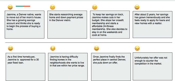
I developed the personas, Nancy and Jasmine based on the experiences and pain points I heard in user interviews


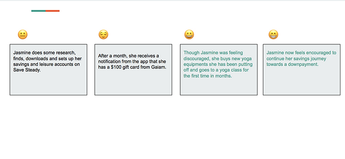
Jasmine's Story


Design Iterations & Challenges
We spent much of our time figuring out how to implement features that would positively affect human behavior, which in this case, encourage people to save. I sketched out the design of the onboarding screen and key features of the app. We did an affinity map to highlight pain points of the users, that were gathered from our interviews.


User Flow
This user flow used as a guide for the usability test.

Mockups
My partner and I created these mockups in sketch. I came up with feature ideation based on needs and pain points I heard in user interviews.


